Our Logo
It is unique. It is exclusive. It is ours.
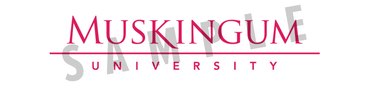
Two-Color Logo:
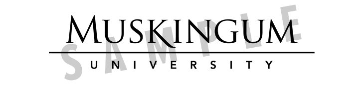
The Muskingum University Logo is our most valuable, visible brand asset. It is a point of pride. It represents and reinforces what we stand for and something to protect. It nods to our history and looks boldly to the future. It speaks of our values and traditions. It is clean, simplistic and authoritative. But remember: a Logo is not a brand. It is just a peek into our brand.
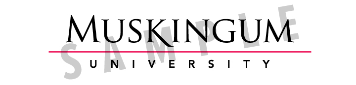
Muskingum’s Logo is ideally depicted with black lettering and a Muskingum Magenta (PMS 2040C) line over a white background, although a secondary use is white lettering with a Muskingum Magenta (PMS 2040C) line over a black background.
The two-color version is always preferred over the one-color version, and both versions must always be used on a solid background. Textured backgrounds are prohibited to maintain the integrity of the logo design. Always maintain space around the logo and other elements unless otherwise noted in the document. Let it breathe. Make it visible.
Minimum logo size:
One-Color Logo:
White on a dark or Muskingum Magenta background are the primary uses of the one-color Logo. Secondary variations are Muskingum Magenta (PMS 2040C) and black Logos over white or light (no more than 15%) colors. The two-color Logo is always preferred. When choosing backgrounds, it is important to consider legibility. The Logo must remain legible at all times.